The Royal Opera House
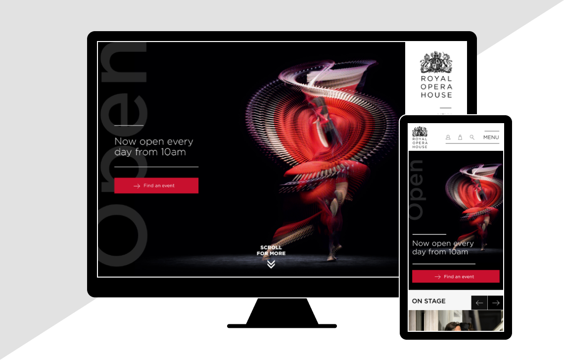
I was hired to lead the web redesign as part of the rebranding of The Royal Opera House. The goal was to bring the website visual design in-line with the new branding and enhance the user experience. We conducted user testing throughout the process to ensure we were are track with assumptions and decisions.
For the concept design phase we conducted competitive analysis and put together mood boards. We worked closely with the project team, involving them at each stage to ensure everyone was onboard from the beginning.
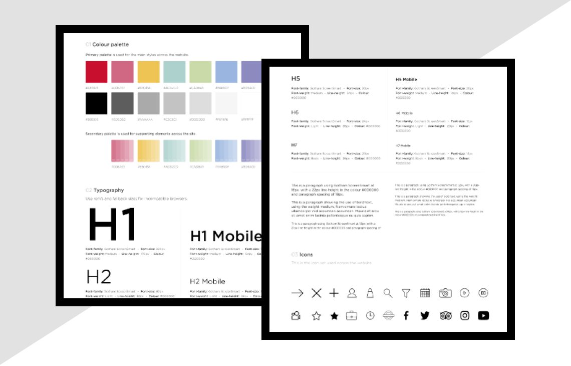
Once key pages were nailed down, we created a style guide to ensure consistency across all digital formats.
We used Principal to put together videos to demonstrate how we envisaged the pages interacting and to guide the engineering team.
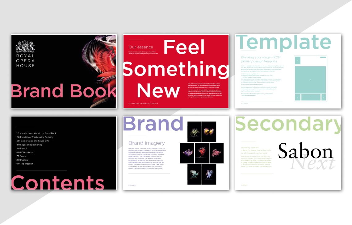
We put together brand guidelines after completing the redesign to guide all future work.
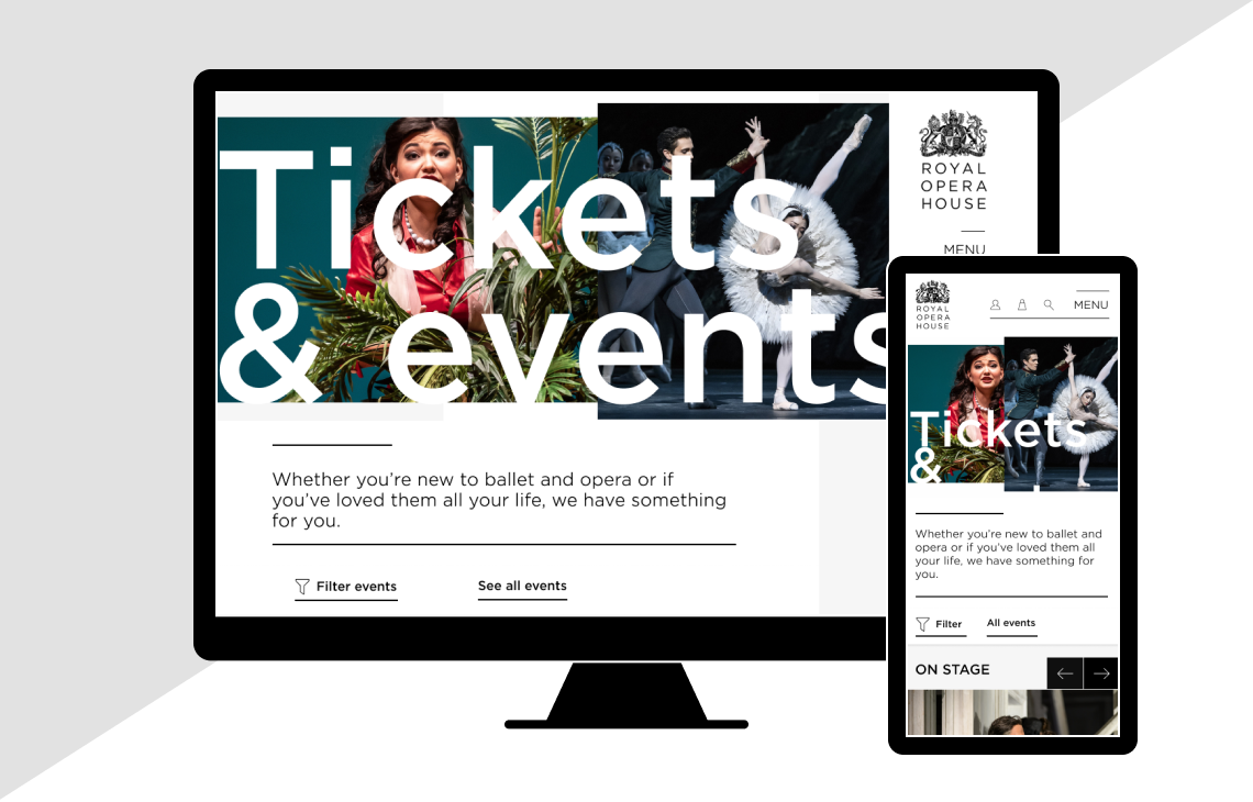
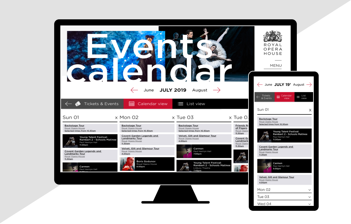
I was brought back at a later date to focus on the Tickets & Events section, we rethought the events calendar, streamlined the booking process making it intuitive and easy to use


