National Garden Scheme
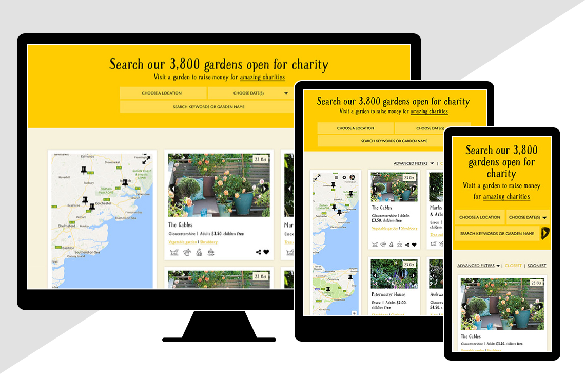
The National Garden Scheme is an incredible organisation, giving people unique access to some of Britain’s most memorable gardens and donating the proceeds to charities. The object of the re-design was to connect more people with more gardens, and increase donations. Key to making this a reality was to build a streamline and intuitive garden search functionality that catered for a range of users. User research revealed that a large portion of users didn’t get the connection with charity, so the new re-design needed to make that relationship clear.
We developed personas and scenarios to better understand the key users. This brought a wide range of demographics, goals and needs to understand and cater for.
We utilised task modelling to better understand the personas different search requirements, and applied these findings to the search strategy.
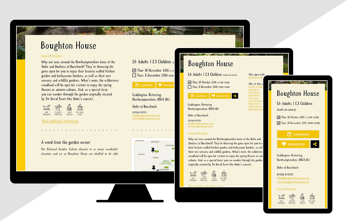
Demonstrating user journeys through the website, helped us to identify behaviours and some key ways to keep the user engaged while helping them achieve their goals. As a result, we introducing an "add to calendar" and "add to favourites" functionality, and made it clear throughout the journey how their visit and donations help charities.
Designing a fully responsive site, we wire-framed three breakpoints. We held regular meetings with the stakeholders to review pages, walking through the user journeys on interactive prototypes, to ensure we had full buy-in at key points.
With wireframe sign off, we then designed key pages. Along with a style guide and a full set of wireframes the development team could start building. We worked closely throughout the build to ensure it was in line with the vision.
A few highlights from the process
- Confirming attendance / add to calendar / add to favourites functionality
- Ensuring no dead ends in the search system
- Offering location based search alongside chronological listings
- Identifying key sharing points and making it easy to involve third parties


